
Week 3 / Zine
Here are some questions from students that I though it would be beneficial to share with all.
Is the layout supposed to look the same for all 8-16 pages?
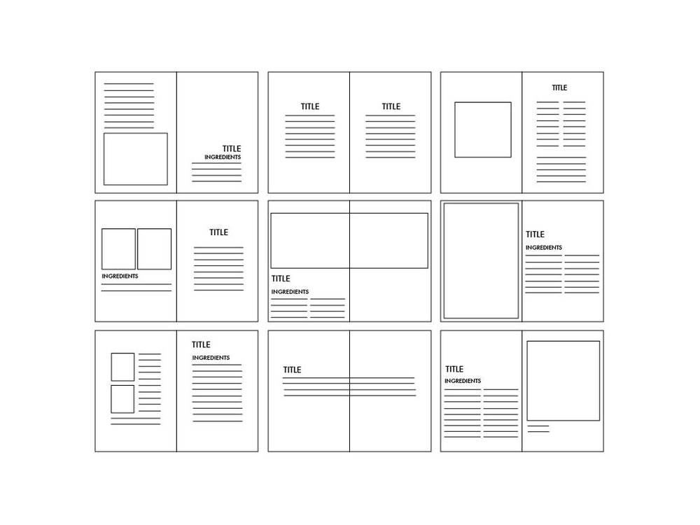
Each layouts should follow the same grid system, but can look completely different. The grid is like a rhythm in the music which helps all the instruments to play together as orchestra. True, you may repeat the same design theme (like folio) on each page, and you may want to stick with the consistent typestyle (typographic hierarchy) throughout. Still, you can play different melody, notes and codes on the rhythm. Often musician improvise and play off the rhythm to create accent (attitude).
How detailed is the draft/layout supposed to be? Are there supposed to be a bunch of placeholders/squares showing where everything is going to go or are we supposed to find pictures/illustrations and put them on the layout? And is each subheading of our essay going to represent each page(s) of our zine?
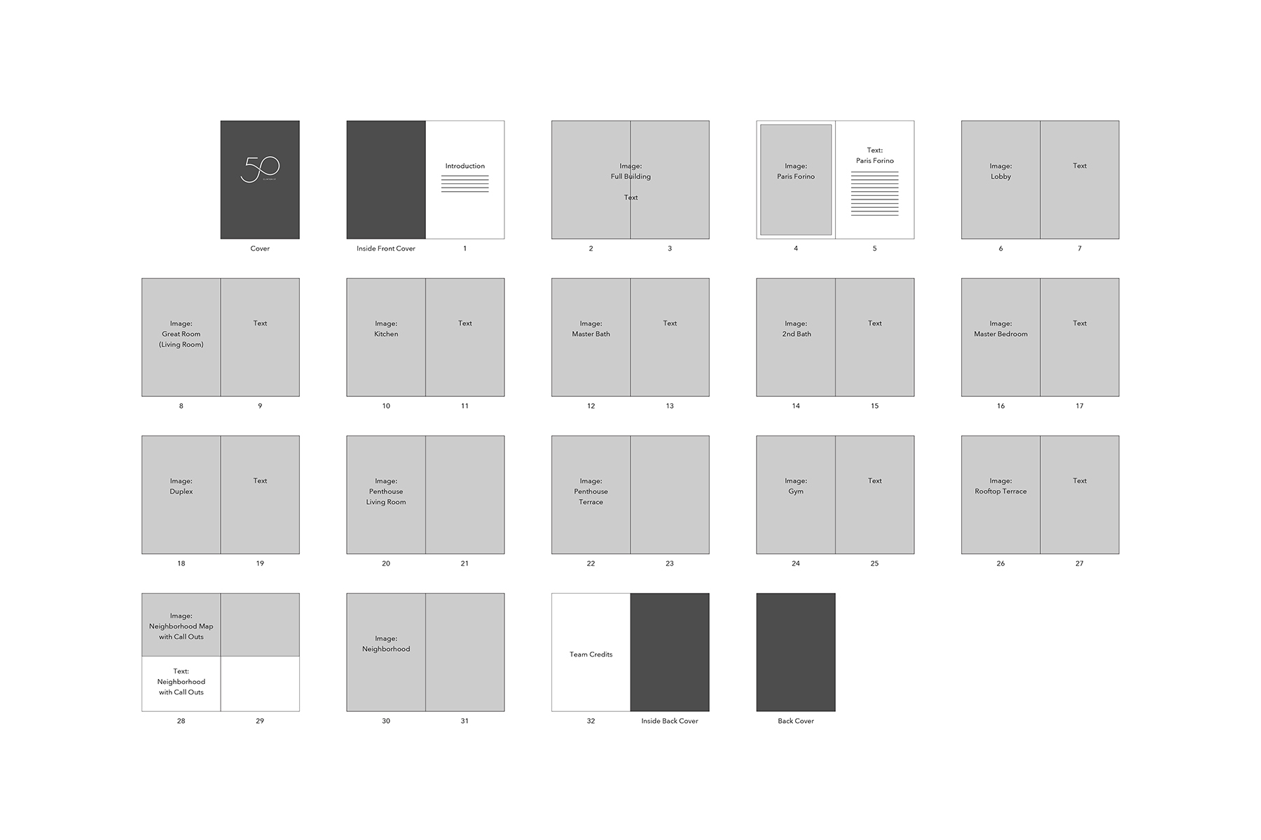
What you’re talking about is probably something called pagination, like below. It’s like a construction plan for magazine. It’ll be very helpful for you to see the overall flow, and make a plan for more image research. You don't need to assign a page for each subheading. You may put few subheading together in one page, and some subheading requires more than one page.
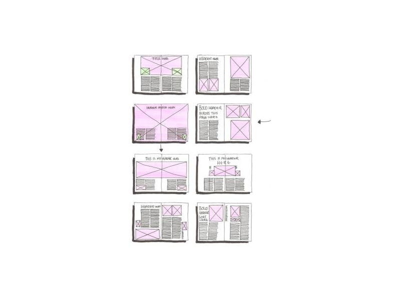
For Thursday, I would recommend to create a few key spreads (cover and a few double page spreads) to shows the design style.
Please feel free to post question on the blow comments section.
[To Be Continue]